In a double act on screen, one of the characters is usually the Comic and the other one is the Comic foil.
The Comic foil is smart and usually says something funny, the Comic, usually plays the not as bright role, he then takes the comic foils joke and ends it by making it more funny.
Some Double acts like French and Saunders or Simon Pegg and Nick Frost don't use this rule and usually change at different times throughout their acts.
Film Posters
Pineapple Express
Two main Characters - Dale and Saul
Dale - Comic foil
Saul - Comic
The poster gives off the impression immediately that this is a stoner comedy film, things like the cloud of smoke which is in the background suggests smoke from a joint. The weapons that are in the hands of Red, Dale and Saul give the impression that this is going to be an action film as well, guns are always used in top action films, Die Hard, Lethal weapon and Bad boys. When we look at the text however we see at the bottom "From the guys who brought you Superbad" and since Superbad was a successful comedy film it's letting the audience of the Superbad film know to come and see this movie because the audience might find this film funny because it will have the same laughs as Superbad. The producers put these lines on the film posters to show how good producers/directors/writers they actually are. The films name "Pineapple express" is in a bright blood red to stand out from the gloomy smoky background, the difference between "Pineapple" and "Express" is that the "Express" is in a bolder font, by separating the words it gives it an effect that makes it more appealing to the audience because each word stands out and makes the audience read more instead of just one line. This colour is also used for the date which is used at the bottom of the poster, underneath the small text of the writers, the cast, the directors and the producers, this uses the same effect as the title by making it stand out more to the audience, the date of the film it's the most better piece of information on there along with the title of the film and the two main actors in the film but as you see this does not apply for the names of the people that were involved in the films making that are in very thin font and are so small that the audience does not even bother in reading it.

Two main Characters - Brennan and Dale
Brennan and Dale change between the Comic and the Comic foil
The poster gives off the impression that this film is about growing up, you can tell this because of the main picture on the poster which is two grown men doing a school photo shoot, the tag line is also "they grow up so fast" meaning that this will be the plot of the movie. The funny side of this movie which makes this a comedy is that they are in fact two grown men acting like two spoilt brats which clash when they are forced to live together. The whole school photo is a pretty good idea because it relates to the tag line "they grow up so fast". Unlike the Pineapple express poster, the step brothers poster does not have the whole cast/director/producer at the bottom of the page instead they have the two main actors in the film, and that is Will Ferrell and John C .Reilly. They have properly done this so people immediately know that this film has two well known comedy actors. Having people that the audience likes and knows makes people want to go and see the film because they know what to expect from the actor and what kind of performance he will put on whether they are serious, funny or dramatic. The fonts used in this look bold, properly to stand out from the picture, they are also in red and white to give it more of an effect where it looks like it's the first thing you see on the page. This poster also does what Pineapple express did and that's by saying what else these guys have made for example the poster says" From the guys who brought you Talladega Nights" which was another successful film by the same people that made this movie. On the Pineapple express poster it said "From the guys who brought you Superbad". This proves so far that this is used to let the audience know what to expect when they see the movie and to see if it's more successful then the last film.
 Harold and Kumar escape from Guantanamo bay
Two main Characters - Harold and Kumar
Harold - Comic foil
Kumar - Comic
This poster gives of the impression immediately that this is an adventure/stoner film. The main thing that gives it away is the tag line, the films tag line is "This time they're running from the joint" which tells the audience that one, this is a Stoner comedy and two this film is a sequel because of the line "This Time" which means that they have got them self's into another mess. The way the title is used on this poster is by making it look like a caution sign on the fence that Harold and Kumar are behind, which looks real because of the font and two colours used, yellow and black which properties are usually found of a caution sign even the way they have set it out also makes it look realistic, another impression the audience picks up on by looking at this poster is that Harold and Kumar get put in jail since there both behind the fence and that they have orange jail clothes on. The reason behind this is to make it clear to the audience what the plot of the film will be, the tag line, the image and the effect it has on the poster are clues for the plot, any person who looks at this poster will immediately know that the adventure in this film is something along the lines of a big misunderstanding, going to jail, escaping from jail, clearing their names and running from the police in the process. This poster does not have any other big names on it apart from the two main characters Harold and Kumar, "John Cho and Kal Penn". I think that this poster is to attract any audience because apart from the word "Joint" there is no other evidence that this film is a stoner comedy because I think this poster is what Kevin Smiths "Jay and Silent Bob" was trying to do and that's by attracting a better audience then the last film, with his being Clerks and this films being Harold and Kumar "Go to white castle/Get the munchies" which is the first film with two different titles. The effect this poster gives off is from the two main characters behind the fence and with Kumar's hand on the fence like it's coming out at you, this is also evidence along with the expressions on their faces, which is a combination of seriousness and confusion, that they didn't mean to get put in prison and that it's not there fault.
 Jay and Silent Bob strike back
Two main Characters - Jay and Silent Bob
Jay - Comic
Silent Bob - Comic foil (Although Silent bob only speaks for at least a minute in the whole movie it's the way his expressions are shown when Jay does something stupid)
This poster gives off the impression that this film will be an action adventure film because of the tag line and map, that the cast have ripped though. The map has a red line from to Newark to Hollywood. The tag line "Hollywood had it coming" tells us that there heading to Hollywood. Although this film is a stoner comedy since Jay and Silent bob are drug dealers, this poster doesn't give us anything whether it's pictures or text that this is a stoner comedy film on the other hand the Pineapple express tells the audience that there film is a stoner comedy, there is a little argument which can tell us why this film did not tell the audience why there film is not a stoner film, reason one could be because Kevin Smith, the director and writer didn't want to give off the impression that this was just another one of those stoner films, thinking that the world has had enough of them or reason two is that they wanted to get a different audience to see the film thinking that the people who love Jay and Silent bob will go anyway regardless of the poster. The title of the film that is represented on the poster, is been made to look like a ring that is on Jay's finger, it gives that effect off because the title has been fit into a rectangle box and has been given a metal shiny look to it. The way they show the cast is differently from the last two posters because they show the names of the seven people on the poster, not in order, but it's shows the seven most big names that are in the film, this attracts the audience because the bigger the names the better chances of that film being worthy to watch even if it's not there taste. Jay and Silent bob strike back has the same thing on there poster which Pineapple expresses poster has and that's the list of people that was involved in the film, it seems that this is a common thing that film posters have and it also seems this has to be shown even though that the audience will not bother to read it.

Two main Characters - Nicholas Angel and PC Danny Butterman
Nicholas Angel and PC Danny Butterman change between the Comic and the Comic foil
(This is quite typical of a Simon Pegg and Nick Frosts film because usually Simon Pegg and Nick Frost never use the Comic and Comic Foil rule in their films but some can argue that Simon Peggs character Nicholas Angel is quite serious and therefore should be the Comic foil but at the end of the film he opens up and is just as funny as Nick Frosts character near the end of the film .)
This poster gives of the impression immediately that this a full action film but when you see the cast "Simon Pegg and Nick Frost" you then think "this must be a Action Comedy" because there first film in the blood ice cream trilogy "Shaun of the Dead" was a really good successful comedy horror film and the audience now assumes that a film with these two actors in has a high chance of the film it's self being really successful and funny. It also has the Shaun of the dead title where it says "A new comedy from the guys who created" then the Shaun of the Dead title/logo, this is what the Pineapple express poster did when they referred to Superbad and when Step brothers referred to the last film Talladega Nights. It's obvious now that the creators like to let the audience know on the posters that this will be good film because their last film was a successful film and want to make sure the audience knows that this movie will have the same quality as the last one. The main give away that this film is full on action is the background and it's a massive explosion, combined with the sight of the policeman costumes, the cool shades, the toothpicks and the shotguns you think that when you see this movie your going to be in for a treat. Even the intro text to introduce the title, which hasn't been done in the previous four films, makes it sound cool because it says "They're Bad Boys, They're Die hards, They're Lethal weapons, They are HOT FUZZ" which makes a reference to three big successful action movies from over the years and it's trying to say "If you like these three movies then you'll love this one". A little effect that's been used which is noticeable is that the "O" in Hot fuzz is the police symbol which gives the audience another hint of the police theme of the movie.

Two main characters - Jack Black and Kyle Gass
Jack Black - Comic
Kyle Gass - Comic Foil
Much like the Hot fuzz poster you get the impression that this film will be an action/adventure because of the explosion in the background, which usually when you see an explosion in a poster you automatically think of the action genre because it's a common thing to see in a action film, you can not get an action film without a least one explosion in, and I think it's because it's a "badass" thing to do in those films. Apart from the explosion in the background, there is nothing else but bits and pieces of the explosion all over the place, the rest is just black round the sides, this could be done to make it look like space, as the aura round the explosion is made to look like something like a supernova, with the purple and bright orange beams shining around the two characters, Jack Black and Kyle Gass, I think it's been made to look like this so the two characters have been shot into space from the explosion which gives the impression that the explosion is earth. It's also tells the audience that the pick they are after is very important and with them nearly leaping off the poster it's telling us that the two characters will do anything to get it. This film is a music comedy, but the poster really doesn't give us much clues that the film is about music except for the guitar pick which they are trying to find but with the movies name being "Tenacious D", the bands actual name in real life, it's obvious to the bands fans that this will be a music film although other people who just like Jack black as an comedy actor will have no idea about this film until they see the trailer of the film or watch the film it's self. This kind of thing brings up points about why we have film posters, the whole point of the film posters is to tell the audience what to expect from the movie, to tell us what genre it is and also what this film will be about. The font used on the movies title "Tenacious D" seems to be bold and in 3-d with a gold border around it, this was properly used to make it stand out movie to the audience and to make it stand out from the black background however the "In the pick of destiny" text is in black but stands out because of the white border and the hot rod flames that are also used as the border, the flames link in with the pick because the pick is shaped like the devil and the flames on that make it look like hell so it gives off the idea that the adventure wont be so easy and the two characters will go through "hell".
Character Film Posters
Although the film of these posters might not have anything to do with my genre, I am looking at these because I am trying to find out how different styles are used on different types of posters and to talk about the impression it gives of to the audience.
Inglourious Basterds
Director - Quentin Tarantino
Writer - Quentin Tarantino

These kind of poster have used the character tag lines to relate to, not only, the movie but also the main characters, for example Lt.Aldo Raine, is played by Brad Pitt. The way these posters have done this is by having a full sized photo of Brad Pitts character from the waist up and by having at the top of the poster the tag line "Brad Pitt is a Basterd" which tells the audience the films memorable word in the title, "Basterd", because not many films would use such a word as there films title and also it tells use who is in the film. These are not the official film posters because they don't have any release dates, production, writer and directors list and these posters don't even have the films name. I think these types are posters are like character profile posters, and the main reason why these are made are to show the audience who is in the film, these types of posters are also most commonly seen at bus stops at the side to promote, not only the film, but also the stars of the film as well. The style and theme to these posters are the same, it has a dark feel to it ,like this will be serious film, and it also has a gritty look to it, this is because of the same background that is used on all five of these posters and it looks like a dirty wall that has been damaged by bullets. The font that is used on the posters looks like it's been typed on be an old typewriter which gives the poster an old look to it, it does this to make it feel like the WW2 era, it's in white to let it stand out from the dark background behind it so it will catch the audience's eyes more, every film poster does this with the color, they all have a color which stands out from the background, for example if it's a light background a dark colors font will be used (Black and white font) or vice versa (White and a black font). This is used to make it more visible to the audience, because what good is a film poster if the audience doesn't know what it says or means. These character posters usually contain only the actor/actress name but not the name role that they play in the film, this might be because the expect the audience to go and see the film and find out for themselves.
The Hangover
Director - Todd Phillips
Writers - Jon Lucas & Scott Moore

There is quite a few character posters for the Hangover, I think it started off with the three above until it came to the point where it become a really successful comedy so it brought out more posters of different characters in the film, for example they brought character posters of Mike Tyson and Heather Graham out and the reason these two are more special is because their both big stars, Mike Tyson being a well known retired professional boxer while Heather Graham being a famous actress and fashion model who is well known for starring in Austin Powers the spy who shagged me and The guru, she also guest stared in the comedy drama Scrubs as the hospitals psychiatrist Molly Clock, this assures the audience who haven't seen it that it could be worth watching is well known people like are involved as the three main characters that the film focuses on are not very well known. The most striking thing about the Hangovers character posters is the "Tagline/Quote" that is used at the bottom. This could be called a tagline or it could be called a quote because for people who have seen the film the they actually do say the lines in the film however this quote/tagline situation is not used on all the character posters, they are used for the more important characters in the film and they are the three above, Phil, Alan and Stu and minor characters Mike Tyson, Jade and Mr Chow, the main characters have a reason for this and it's because their the people who are hung over and have caused the problems when they were drunk, while the minor characters are the ones who the main characters have stolen from, married or kidnapped thus creating their quotes from the film, the other three posters don't have a quote from the film but rather a line that relates to the film for example the one that's under the Tiger says "Where Doug" which gives audience more information about the film this could relate to Doug's poster, who's character the plot revolves around, says "Have you seen this man" which gives the audience enough information to let them know that this character gets lost and that the characters are trying to find him. You could say that Doug is a main character since he goes with the other three main characters to Vegas and it's also his stag do but we don't see him throughout the film when the three main characters wake up the next morning since the Tiger poster and Doug's posters makes it clear that it's their mission to find him. The quotes on the main characters lets the audience know what crazy stuff they have done in the film that would want them to go and see this movie for example Phil's character has "I stole a police car" which the audience might want to know how and why he has stolen a police car or maybe they want to go and see the film to see how Stu lost his tooth as his tagline/quotation is "Am I missing a tooth?". When the audience looks at each character poster they can see that in this film the characters, Phil, Alan and Stu get into a lot of trouble because of the stuff they did when they were drunk, they might of already established that the character Doug goes missing with his character poster, the Tigers character poster or if they have seen the trailers for the film which does tell the audience that they have "lost" Doug but they other things the audience can see from the character posters is the three characters looking rough like they have been beat up, the baby and tiger they have stolen and baby which looks like they have stolen it, the chicken that is involved with them in someway, Mike Tyson is a good example it shows the audience that they stole the Tiger off him and they are in some deep trouble with him and that they have also got in trouble with Mr chow as his line says "You mess with the wrong guy". All these clues in these posters give the audience a reason to go.


Harry Potter and the Half blooded Prince
Director - David Yates
Writers - Steve Kloves and J. K. Rowling
(novel)

Harry Potter and the half blooded prince have good examples of character posters because this film has been promoting it's self for a while now, as it was supposed to have a release for November 2008 but since Warner bros wanted more money they decided to not let it compete against Christmas blockbusters and released it in summer 09 instead. Over time the 6th film has been promoted loads ever since, to build up the excitement of the audience for summer 09. The difference with the Harry potter posters to Inglourious Basterds is that they don't the name of the actors/actresses that were in the film while the film Inglourious Basterds does, the main reason here is because this is the 6th harry potter series and by now people, especially in the UK since these are UK film posters, know who the characters are played by so they don't need an actors or actresses name on the character posters, also British audiences would know their names ,not because it's just a British movie it also has British cast as well. Just by looking at these character posters you know that this film has gotten darker, the reason for this is because the cast have got older as the film has progressed, this is more appealing to the audience because it gives off a different feel to each film so it's not the same as the previous film, the main reason being that the audience will think that the franchise is getting repetitive and wont go and see the next one. Films have to change something in there film mainly because they have to draw the audience to the poster and make them want to see the film, the Harry Potter one with Harry is a perfect example because even if you have read the books you need to see the film because you want to see the characters get more mature and serious about the plot that circles each individual character and how this will be shown to the audience by the end in "Harry Potter and the deathly hollows part 2". I think what each Harry character poster shows the audience is how much the story has influenced him by each film or how the story will influence him, the first character poster was when the sequel came out in 2002, the chamber of secrets, Daniel Radcliffe is at a young age and when the audience looks at his character poster they still see a young, vulnerable boy who is still not sure of the magical things that he is surrounded by, but as the story unfolds and as each movie goes by, which is like a school year at Hogwarts for Harry and his pals, they all seem to get wiser about magic and the war that slowly develops between them, and the evil Voldemort. As the plot thickens, the darker the story gets and this is shown to the audience by the character posters, by the sixth film we don't see a young vulnerable boy anymore, we see a grown boy who has become much stronger, wiser and is prepared to take on any challenge that he is faced within the film and this is because he knows by the events that have happened in the previous films that it is his destiny to finish what has been started. You can tell on the forth movies character poster that this is the start of where it really becomes more serious, not because of the resurrection of Voldemort because the viewers wont know that unless they have read the book or watched the film, but they will know when looking at the Goblet of fire character poster that this has happened because the poster has been simplified and it just has Harry standing with a serious look with a pure black background with smoke arising from the bottom. I think this will be a returning theme up until the last films Deathly Hollows part one and two because it is the time where the film leads up to it's shocking conclusion and will be the final fight between Voldemort and Harry.


Ways Harry potter have presented the Character posters 2-5
The first film did not have character posters because it was the first one in the franchise and also because the characters weren't established characters until the second film.
Harry Potter and the Chamber of Secrets, Prisoner of Azkaban, Goblet of Fire and the Order of the Phoneix
How Movie Posters has influenced other types of Media
Movie posters have popped up in other types of media, the biggest example is how console games have used this, the Xbox 360 game Left 4 dead and it's sequel has took the main elements from movie posters and have made the 4 to 5 chapters in the game into mini horror movies, as the game is a Zombie co op shooter. So because of this they have made a movie poster for each campaign.
Left 4 Dead
The main thing you notice while looking at these in game movie posters, is that each one is different, the reason for this is that each campaign continues for the last one, for example the mission in No Mercy is to get to Mercy hospital, that campaign has five chapters and on the fifth chapter is when you contact the rescue vehicle, so for No Mercy that's when you contact the rescue vehicle, a helicopter from the hospital roof top, you get away and you have then completed the No Mercy campaign, the chapters do continue from each other but you never see what has happened since you get into the rescue vehicle, the only time you have seen what has happened is the DLC (Downloadable Content) Crash Course, where it shows you how the helicopter crashes from the No Mercy campaign and how you get to the start of Death Toll.
Another thing you will notice is the effect used on the posters, it has a gritty retro look to it and the poster it self looks like it has been scratched, ripped and crumpled up. The reason they have done this for the game is to make it look like something has gone wrong in the characters world, so it gives it the "Zombie apocalypse" look to the audience. The titles of the campaigns relate to the actually name, for example the letter "A" in "Dead Air" has got a plane symbol through it, Valve have done this to give the titles more of a catchy look and feel to it. Another real movie poster element Valve have used is the taglines on each campaign poster.
The games sequel (Posters with different characters) also followed the same style as Left 4 Deads posters


 Bill Hader and Seth Rogen as Officer Slater and Officer Michaels in Superbad. These two cops seem to want teenagers in the film to know that cops aren't that bad even by doing some crazy funny things which most mature adults are not supposed to do.
 Simon Pegg and Nick frost as Nicholas Angel and PC Danny Butterman in Hot Fuzz. Angel is more serious at the start of the film but Danny gets Angel to become more fun and to not take his job seriously.
 Paul Blart played by Kevin James, again another mall security cop but just like Seth Rogens character Ronnie, Paul also wants to be a Policeman and tries to act like one throughout the film. He's also very dedicated to his job, like saving it from terrorists who took over the mall even with his unfit, large figure.
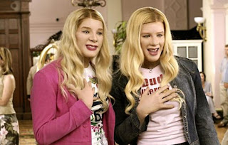 FBI agents Kevin and Marcus Copeland disguise them self's as the Wilson sisters to protect them from a kidnapping. The two brothers can be racist throughout the film, but also can joke on about their own race. Quote to from the brothers in disguise to their Boss in the hotel "What a Beautiful chocolate man"
 From the film Rush Hour. Detective James Carter and Chief inspector Lee are joint together when Lee's friends daughter is kidnapped in America. Carter has been assigned the case and partners up with Lee. The pair are funny throughout the film because they can be laugh at each others ethnic backgrounds. For example when Lee is singing Carter says, I quote, "You sound like a Karate movie" as he is Asian.
 Detective Axel Foley played by Eddie Murphy is another stereotypical black cop in films where he plays the cheeky, quick witted detective who can be serious at his job but can make jokes out of situations, just like James carter from Rush Hour or Kevin and Marcus from White chicks. From the film Beverly hills cop 1-3. With the 4th film coming out in 2012.
 A movie of the series was produced, it still follows the characters from the series but this time set in Miami. The plot see's the bunch of idiots go to a police convention in Miami, but they turn up late and find out all the policeman in Miami have been quarantined in the building by terrorists and the only cops left to save the day are the Reno squad, but as any person can see, as there a bunch of idiots, you know what's going to happen, their going to mess up things along the way.
 This poster is something like what we want to do for our poster. This is perfect because it features two people and has the Mall cop/Police theme to it.


